
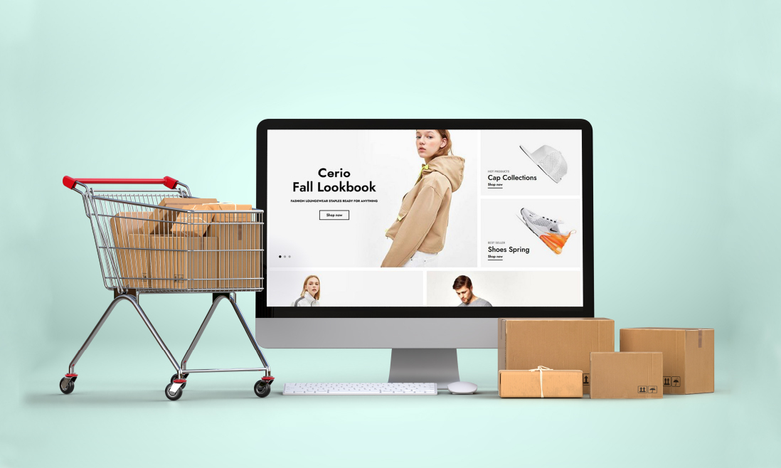
Ecommerce is not just about selling products online, but about creating an immersive, engaging, and seamless shopping experience. Magento, known for its flexibility and scalability, stands at the forefront of this ecommerce revolution.
In this blog post, we dive deep into the art and science of ecommerce design. We’ll explore a spectrum of innovative design strategies – from the subtle allure of color gradients and the dynamic interaction of CSS grid layouts, to the cutting-edge appeal of cinemagraphs and the personalized touch of tailored user experiences.
Each tip is designed to enhance your Magento store’s aesthetic appeal, improve user engagement, and ultimately drive conversions. So, buckle up and get ready to transform your Magento store into a stunning, high-performing ecommerce powerhouse.
Contents
1. Colorful Pages and Gradients
Color is not just an aesthetic choice—it’s a communication tool. Different colors evoke different emotions and reactions. For instance, blue can instill trust and security, while orange might signify energy and enthusiasm. In the context of a Magento ecommerce store, the strategic use of color can guide customer emotions, influencing their perception of your brand and products.
Gradients add depth and texture to your design. They can create a sense of dynamism, guiding the eye smoothly across the page. When used effectively, gradients can highlight important content, create a mood, and even improve user experience by distinguishing different sections or elements on your website.

2. CSS Grid Layout
The CSS Grid Layout stands out as a cornerstone of modern, efficient, and flexible design. Its emergence as a popular design choice is no coincidence; it’s a testament to its ability to simplify complex layouts and adapt to various devices and screen sizes.
The CSS Grid Layout offers a straightforward yet powerful approach to arranging content. It allows designers to create complex layouts that are both aesthetically pleasing and highly functional. With the grid system, every element has its place, creating a harmonious balance between visual elements and the overall user experience.

3. More Artful Photography
More than ever, Magento ecommerce stores are embracing the trend of artful and illustrative photography to make their products pop. This approach isn’t just about taking high-quality pictures; it’s about crafting images that are as unique and memorable as the products themselves.
Artful photography brings a bold and edgy element to product presentation. By moving beyond traditional product shots, you can create a distinctive visual language for your brand.
This might involve using illustrative set designs that are handmade from paper, or incorporating advanced techniques like 3D mappings and visualizations. The goal is to create images that not only showcase your products but also tell a story and evoke emotions.

4. Bold, Bright, Minimalist Graphic Design
The adage “less is more” holds true, especially when it’s about blending minimalism with bold, bright elements. By focusing on simplicity and marrying it with vibrant colors and large fonts, you can craft a Magento store that’s both visually stunning and effortlessly navigable.
Bright, saturated colors are pivotal in minimalist design. They capture attention and convey emotions effectively. Vibrant colors, when used strategically, can guide customers’ eyes to important elements like call-to-action buttons or special offers. In a minimalist setting, these colors don’t just add aesthetic appeal; they serve a functional purpose.

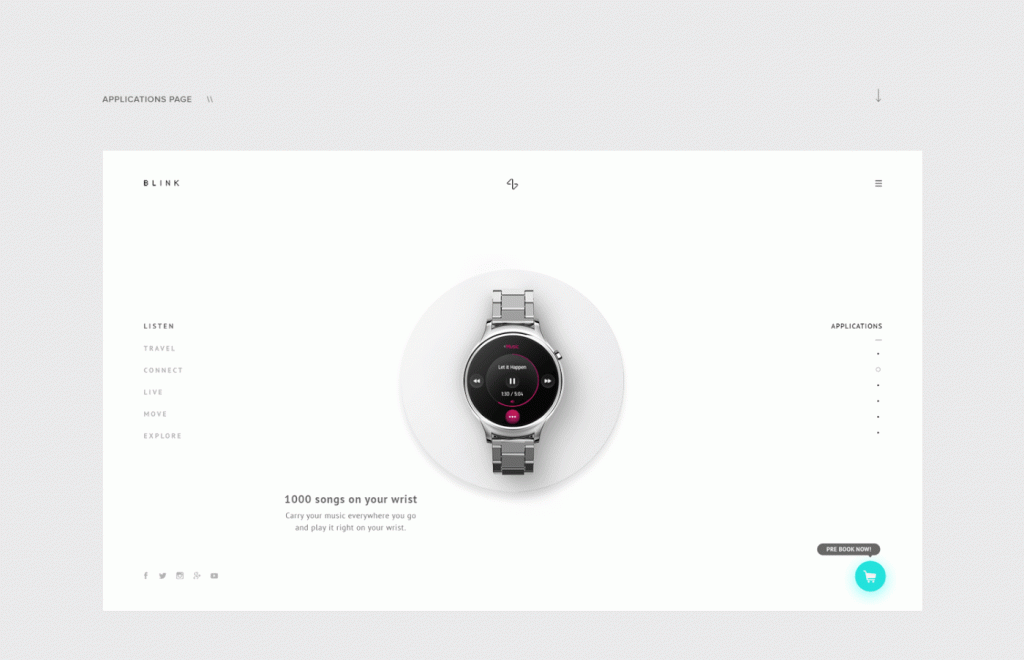
5. Interactive Mouse Pointer
Interactive mouse pointers are emerging as a novel way to engage users. This isn’t just about adding a fun element to your site; it’s about creating a more immersive and interactive experience for your customers.
The beauty of interactive mouse pointers lies in their versatility. Depending on your brand identity and the nature of your products, these pointers can range from minimalistic designs that change shape or color upon hovering over certain elements, to more elaborate animations that react to clicks or movements.

6. Illustrations and Animations
The purpose of illustrations is to set a tone for your brand and add playfulness to your design. They can be of any size, style, color and incorporated into any website design flawlessly.
Simultaneously, the animations help us convey information more efficiently and capture customer attention in a few seconds.
In Magento eCommerce websites, motions also are the signals of delight, personality, and urgency. For instance, we can use animated iconography to notify people when they are almost sold out and stimulate their purchases.
However, remember that all the animations/ motions in your store must be subtle. Overdoing it will annoy the visitors instead of interesting them.
7. Parallax Scrolling
Parallax scrolling, where background content moves at a different speed than foreground content during scrolling, offers a unique and engaging visual experience.
Parallax scrolling creates an illusion of depth, adding a 3D-like effect to a traditionally flat web page. As users scroll down, the varying speeds of the background and foreground layers produce a dynamic, interactive experience.
It’s like adding a touch of cinematic depth to your website, making the user’s journey through your site not just informative, but also visually enthralling.

8. Mobile-Friendly Design
The shift towards mobile shopping has been rapid and decisive. Customers are now more likely to browse, compare, and purchase products on their mobile phones than on a computer. This change in consumer behavior demands an equivalent shift in ecommerce design, prioritizing mobile responsiveness and user experience.
With a significant portion of consumers preferring their smartphones for shopping, ensuring that your Magento ecommerce store is mobile-friendly is not just an option, it’s a necessity.

9. Efficient Loading and Layout
Slow loading times can be a major deterrent for online shoppers. In an age where instant gratification is the norm, customers expect quick and seamless access to product listings. Efficient loading techniques, such as loading the first set of products immediately and then gradually loading additional items as the user scrolls, can drastically improve the user experience.
The performance of your Magento ecommerce store plays a crucial role in customer satisfaction and retention. Particularly for stores with extensive product listings, optimizing page load times and layout efficiency is vital. Implementing strategies like efficient loading can significantly enhance user experience, ensuring that customers stay engaged and are more likely to complete a purchase.

10. Hamburger Menu
The hamburger menu has emerged as a key player in simplifying and enhancing website navigation. Recognized by its iconic three horizontal lines, the hamburger menu is a compact and efficient way to present navigation options to users, especially valuable in optimizing space and improving usability on smaller screens like smartphones.
The hamburger menu is a minimalist navigation tool that hides the website’s main menu items behind a simple icon. This design choice frees up valuable screen real estate, allowing for a cleaner, more focused user interface. When clicked, it reveals the full range of navigation options, offering users an intuitive path through your site without overwhelming them with choices upfront.

11. Cinemagraphs
In the visually saturated world of ecommerce, standing out is key. Enter cinemagraphs: a mesmerizing blend of photography and video. These dynamic images feature subtle, repeated movements, creating a captivating visual effect that holds viewers’ attention far longer than static images.
When used in a Magento ecommerce site, cinemagraphs can bring products to life in a way that is both innovative and engaging.
Cinemagraphs are more than just animated images; they are visual stories. By isolating movement in a part of the image while keeping the rest static, they create a hypnotic balance between motion and stillness. This unique quality makes them an eye-catching addition to any webpage, capable of drawing and retaining customer attention in a way that traditional photographs often cannot.
12. Adaptation To The Users
While ensuring your site looks great on any device is fundamental, true adaptation involves understanding and responding to your users’ individual needs and preferences. This could mean adjusting design elements like font size and button placement based on user demographics or browsing habits.
This approach goes beyond responsive design; it’s about creating an intuitive and inclusive shopping environment that caters to diverse user characteristics such as age, habits, visual acuity, and even specific physical requirements like color vision deficiencies or left-handedness.
13. Video Integration
Videos have the power to convey complex information in an easily digestible format, making them an invaluable asset for any online store.
Videos provide a richer, more immersive experience than static images or text alone. They can quickly capture a customer’s attention and effectively communicate key messages or product details. Whether it’s showcasing the elegance of a product, providing how-to guides, or sharing your brand’s story, videos add depth and clarity to your customer’s shopping journey.
By providing a more dynamic, informative, and engaging medium, videos can help you convey your message effectively, leading to increased customer engagement and potentially higher conversion rates.

14. Testimonials & Reviews
In the digital shopping landscape, where direct product experience is absent, testimonials and reviews serve as crucial indicators of trust and quality. For Magento ecommerce stores, integrating customer feedback not only enhances credibility but also provides valuable social proof that can influence purchasing decisions.
For online shoppers, testimonials and reviews are akin to personal recommendations. They offer reassurance about the quality and value of a product from those who have already experienced it. A store with a wealth of positive feedback is likely to be perceived as more trustworthy and reliable, which can be a decisive factor in converting visitors into customers.

15. Fixed Navigation Panel
The user experience can be greatly enhanced by intuitive and accessible navigation. This is where the concept of a fixed or sticky navigation panel, particularly for elements like the header menu, becomes invaluable. By remaining visible as the user scrolls, a fixed navigation panel provides constant access to key site sections, making browsing more efficient and user-friendly.
A fixed navigation panel ensures that important navigational elements are always within reach, no matter where the user is on your site. This consistent presence eliminates the need for users to scroll all the way back to the top to access different sections, streamlining their browsing experience and saving valuable time.
16. Focus On Personalization
Tapping into the potential of personalization can create a more engaging, individualized shopping experience that resonates with customers. Personalization makes shoppers feel valued and understood, often leading to increased loyalty and sales.
Personalization in ecommerce is about showing customers that they are not just another number. It involves tailoring the shopping experience to meet individual needs and preferences, whether it’s through customized greetings, recommendations, or reminders. Such attention to detail can significantly enhance the shopping experience, making customers feel more connected and valued.
17. Calls To Action
A well-designed CTA is a clear and direct invitation for your customer to take the next step, whether that’s making a purchase, signing up for a newsletter, or learning more about a product. The right CTA can significantly increase conversion rates by reducing friction in the customer journey and making the path to action unmistakable.
By designing CTAs that are visually striking, easy to find, and simple to understand, you can guide customers smoothly through their purchasing journey. Remember, the goal of a CTA is to transform passive browsers into active buyers, and with the right design approach, you can make this transition as seamless and inviting as possible.

18. Micro Interactions
Micro interactions are all about detail – a button that changes color when hovered over, a small animation when an item is added to the cart, or icons that expand to reveal more information. These interactive moments capture user attention and provide immediate feedback on their actions, making the browsing experience more intuitive and engaging.
These small, interactive design elements, often in the form of subtle animations or changes that occur in response to user actions, can significantly enrich the browsing experience on your Magento ecommerce site.
19. Dissymmetry And Brutalism
Dissymmetry, with its intentional imbalance, guides user attention effectively, while brutalism’s raw and bold aesthetic has found a unique place in luxury e-commerce.
Dissymmetry in web design involves creating layouts that are intentionally unbalanced yet harmonious. This approach breaks away from traditional symmetric layouts, offering a fresh and dynamic user experience. In Magento ecommerce, dissymmetry can direct user attention from one point to another more effectively, keeping the browsing experience engaging and unpredictable.
Brutalism in web design is characterized by its stark, raw, and bold aesthetic. Often employing a minimalistic color palette, simple typography, and a bare-bones approach to layout, brutalism can convey a sense of authenticity and confidence. In luxury ecommerce, brutalism aligns well with brands that want to stand out with a bold and unapologetic online presence.
20. Full-screen Search And Forms
Full-screen search interfaces create an immersive environment for users, allowing them to concentrate solely on their search. This approach minimizes distractions and makes the search process more intuitive and user-friendly, especially on mobile devices where screen real estate is limited.
Similarly, full-screen forms provide a more engaging and less cluttered way for users to interact with your site, whether they’re signing up for a newsletter, creating an account, or filling out a contact form. This approach can improve the user experience by making forms more approachable and easier to complete.