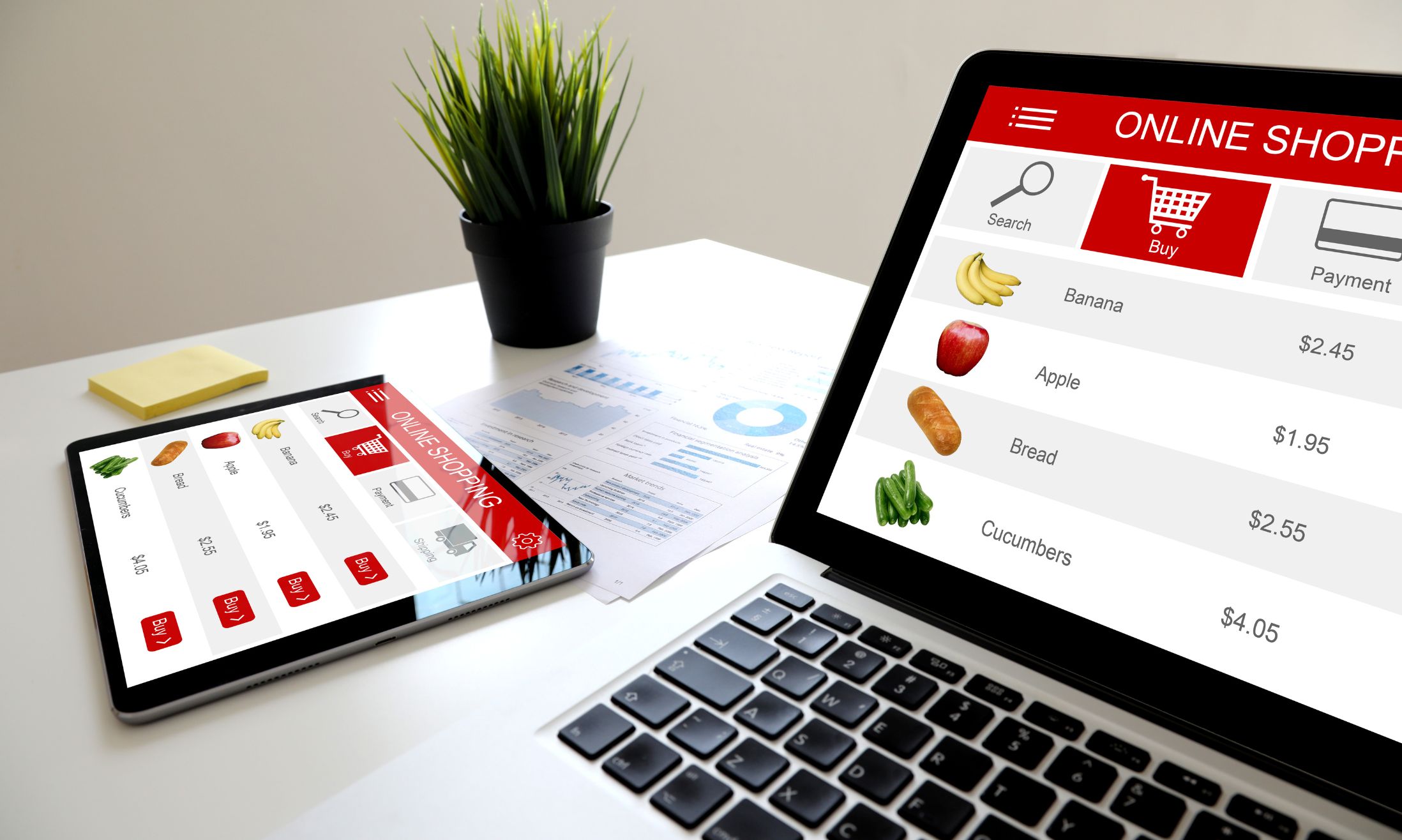
Flat design — the art of minimalism, where every pixel serves a purpose, and there’s no room for the superfluous. It is all about keeping things simple and clean. It’s where less is more, and every detail has a purpose.
But don’t mistake simplicity for a lack of creativity! When executed correctly, flat design can turn a webpage into a visual masterpiece, telling a compelling story with fewer elements. Curious to see this understated elegance in action?
Check out these 20 amazing flat design website examples. Get ready to be wowed!
What Is A Flat Design Website?
Flat web design, often termed simply as “flat design”, is a contemporary style of designing websites and applications that focuses on simplicity and clarity by using 2D visual elements.
Its minimalist approach sets it apart from other design philosophies by stripping away three-dimensional attributes such as bevels, textures, and gradients. This section will delve deep into the history, characteristics, and evolution of flat design.
Origins and Evolution of Flat Design
Flat web design can trace its roots back to the Swiss Style of the 1950s, a graphic design movement known for its clear and legible Sans-Serif typography. Swiss Style laid the foundation for a harmonious integration of text and imagery, emphasizing both aesthetics and function.
By the early 2010s, the digital world was looking for a design respite from skeuomorphism, which attempted to replicate real-world objects and materials. Apple’s website in 2010, for example, was replete with skeuomorphic designs. The transition was evident by 2020, with flat symbols and designs dominating the user interface.
Microsoft is often credited for popularizing flat design in the digital domain, with Apple and other tech giants soon following suit. It wasn’t long before flat design became the go-to for websites, applications, software interfaces, and even logos.
Key Traits of Flat Design
- Modern and Digital-Friendly Aesthetic: Flat design feels inherently digital, foregoing real-world mimicry for clean lines and bold colors.
- Minimalist Styling: A minimalist approach ensures that only essential elements are retained, reducing clutter.
- Grid-Based Layouts: These designs are often built on symmetrical grids, providing a sense of order and predictability.
- Bright Colors and Readable Typography: The use of high-contrast colors and bold typography makes flat design websites both attractive and user-friendly.
- Symbolic Icons: Rather than detailed illustrations, symbolic icons are used to convey concepts quickly.
- Simplicity: By avoiding gradients, textures, and abstract forms, flat design emphasizes straightforward visuals.
Flat Design and Swiss Style
While flat design emerged as an antithesis to skeuomorphism, its inspiration was deeply rooted in the Swiss Style. The International Typographic Style, as it’s also known, championed minimalism, legibility, and functionalism. Modern flat design has certainly borrowed elements such as contrasting color palettes, grid-based layouts, and straightforward typography from Swiss Style.
Flat Design 2.0
Despite the popularity of flat design, it was soon evident that its extreme simplicity occasionally hampered user experience. Without clear signifiers like raised buttons or colorful hyperlinks, users struggled to understand interactive elements.
Enter Flat Design 2.0 or semi-flat design. This evolved style blends the simplicity of flat design with some subtle three-dimensional elements, enhancing user experience without compromising on aesthetics. The resulting design approach ensures that while the visual appeal of flat design remains, users can navigate the digital space with confidence.
Flat design, with its clean lines, bright colors, and minimalist approach, has reshaped the digital design landscape. It not only prioritizes aesthetics but, in its evolved form, also ensures a seamless user experience. As design philosophies continue to evolve, flat design’s emphasis on clarity, simplicity, and usability will likely remain timeless.
What Are The Main Factors Of A Flat Design Website?

A flat design is a style of web design that emphasizes simplicity and minimalism. It uses clean, uncluttered designs with limited effects and gradients. Flat designs are popular because they make websites easier to navigate, faster to load, and eyesore-free.
There are several crucial factors to consider when designing a flat design website:
Layout
The layout is key when it comes to creating an effective website. Too often, websites are cluttered and difficult to understand. The layout should be simple and easy to navigate, with no hidden layers or confusing buttons. Everything should be accessible from one location on the page.
This principle can be applied not only to the design of a website but also to the content itself. Make sure your writing is clear and concise, without any unnecessary jargon or complex sentence structures. Your readers will thank you for it
Colors
When creating a website, it’s important to use colors that harmonize well together. Colors should be selected based on their complementary nature – colors that are opposite of each other (such as red and green) tend to clash and look unpleasant. Additionally, different colors can work well together if used in moderation – for example, blue and yellow can create a refreshing effect.
Once you have chosen the colors that you want to use, make sure they’re applied throughout the site in an appropriate manner. Try not to overuse one color or mix too many different colors together; this will result in a chaotic appearance instead of a cohesive one. Also, avoid using bright neon tones – they will easily overwhelm the rest of your design and distract from your message.
Images
Image sizing is one of the most important factors when designing small spaces. Images should be scaled down to fit into the available space without losing detail or quality. This means that you need to make sure your images are at least 60% of their original size (or smaller).
Here are a few tips on how to resize images properly:
- Use an image editor like Photoshop or GIMP, which both have built-in scaling tools.
- Try using the ‘Fit Image To Selection’ option in whichever editor you’re using. This will automatically rescale the image according to the boundaries of your selection area.
- Use ruler guides as a reference when resizing images, especially if they contain large amounts of text or graphics. Rule 1/8th inch marks work well for this purpose; use more marks as needed until you have correctly sized all your elements relative to each other.
When you’re happy with the size of an image, save it as a PNG or JPG file. Note that GIFs are not recommended for small spaces – they can be very large and take up a lot of space on your page, which could otherwise be used for content.
Content

Correctly themed graphics and content can help your customers find what they’re looking for faster, which will lead to more sales. When it comes to designating a theme for each product category, there are a few things you should keep in mind.
- Think about the primary purpose of the graphic or article. Is it to sell a product? To explain how the product works? To help your customers make an informed purchase? Then, use that information as your guide when determining which theme to use.
- Consider the target audience for that particular product category. Are all of your products geared toward beginners? Do you have categories dedicated specifically to pets or pregnant women? If so, then select a corresponding theme accordingly.
- Be consistent with your chosen theme throughout all of your graphics and articles related to that topic area. This way, customers who encounter one piece of content while browsing through your site will be able to understand its contextually within the entire site’s design scheme
For example, if you are a clothing store, make sure all of your graphics and text are geared toward clothing products. If you sell kitchen supplies, then emphasize recipes and cooking tips in your content. The key is to think about the specific topic area that you offer and use appropriate terminology when describing it.
Doing this will keep customers from getting lost in a sea of unrelated information, and they’ll be able to quickly discern which items on your website relate to their interests (and purchase them accordingly).
Top 20 Examples Of Flat Design Website
There’s no question that flat design is in vogue these days. It’s simple, elegant, and attractive – just what many businesses need to stand out from the competition. Below, we’ll showcase 20 examples of beautiful flat design websites. From high-end fashion retailers to small business owners looking for a fresh look, there’s something for everyone on this list!
1. Gadget Flow
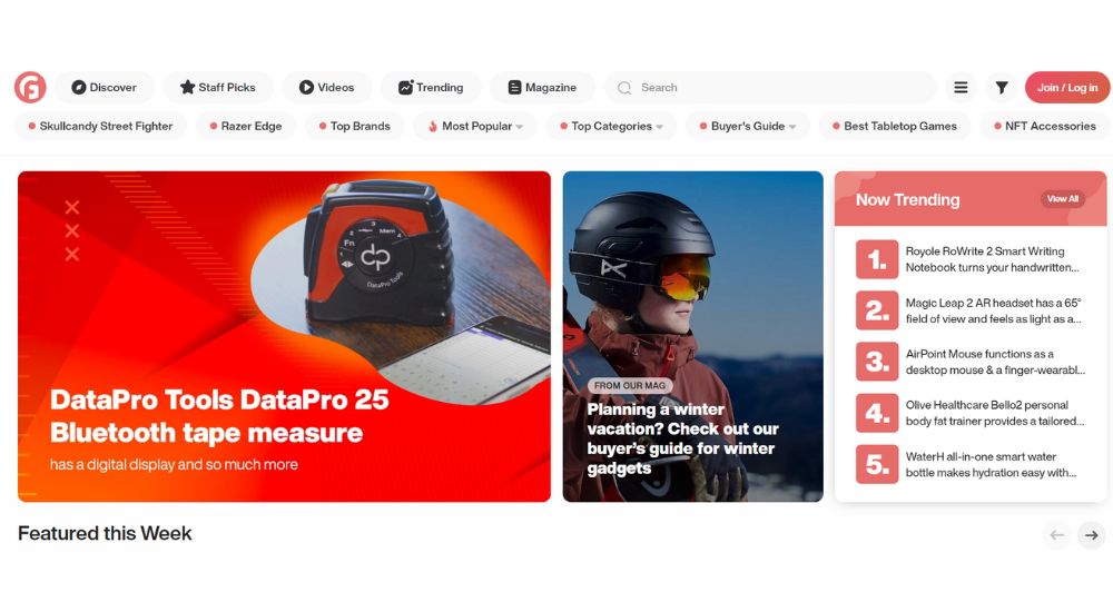
Gadget Flow is a curated hub that showcases the best tech gadgets from around the internet. It provides direct links to product pages on third-party eCommerce sites, so you can easily find and buy the products you’re looking for. It has a great-looking website that uses bold colors and cool images to stand out. The full-width flat UI design makes it easy to navigate, and the site is well organized. The menu items are easy to find, and the blog is updated regularly.
2. Chopard

Chopard is a luxury watch and jewelry store that deals with some of the world’s most prestigious luxury brands. It has an impressive website that is both classy and chic, with brilliant use of images that are cool, GIFs that are dynamic, and a touch of flat design. Overall, it’s an excellent website that would be perfect for anyone looking for a dazzling collection of watches and jewelry.
3. ShopBazaar.com
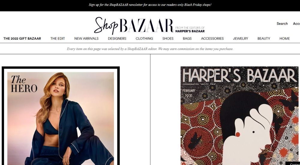
ShopBazaar.com is a luxury fashion online store that offers high-quality designer clothes at affordable prices. It’s a great place to find stylish clothing that won’t break the bank. With a monochrome flat UI and elegant design, it’s easy to see why this store is so popular among fashion lovers.
4. Gant
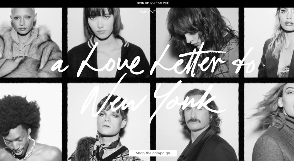
If you’re looking for an upscale fashion store that caters to both men and women, then Gant is the place for you. It’s a store that features mostly black and white UI with a clean display of product images on a fully white background. There’s a variety of stylish clothing available, and it also has a wide selection of accessories.
5. 7 Diamonds
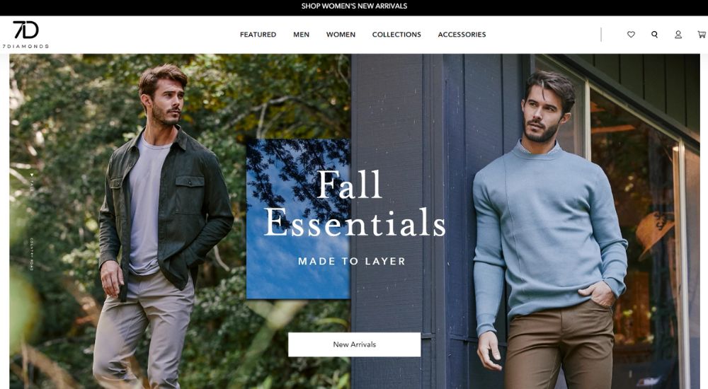
For both men and women, 7 Diamonds is a fantastic fashion shop. On product listing pages, it has a great, complete, and diverse collection of photos that aid to attract customers. The site has a wonderful selection of big stunning visuals that link to different areas of the site’s content.
6. Hard Graft
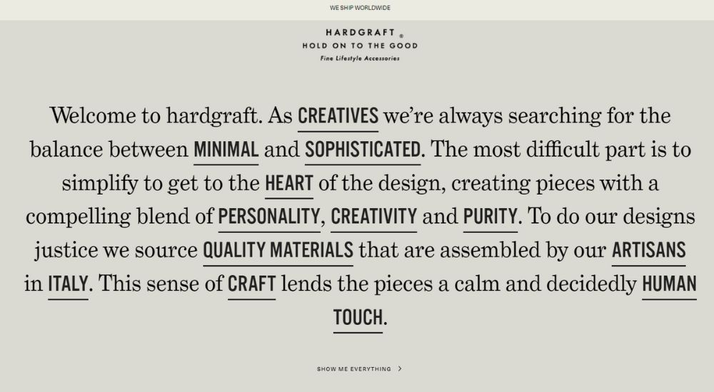
Hard Graft is a lifestyle accessories brand that has crafted an excellent elegant website. The product photography is top-notch, and the user experience when browsing the product gallery is delightful. When purchasing lifestyle accessories, the shop provides a great variety of products and gives a wonderful experience.
7. Grovemade
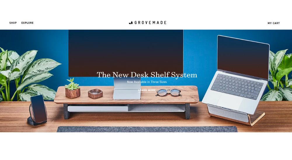
Grovemade is a company that sells wooden handcrafting goods. It has well-crafted images, simple but effective, displaying the products in all their glory without overdoing it. The use of light and shadow is particularly effective in creating a sense of depth and realism. Additionally, the use of white space provides a clean and organized look that enhances the overall aesthetic appeal of the site.
8. CoffeeBeansDelivered
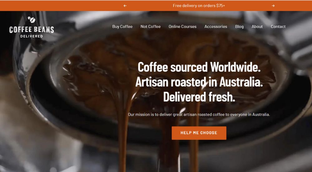
On this website, you can buy coffee beans from all over the world. The website has a great selection of different types of coffee beans, and the prices are really affordable. The store has a really great selection of websites with shades of brown, black, and orange that will make you drool. The rich images on these are perfect for showing off your unique style. Plus, they look amazing on any device – desktop, laptop, tablet, or phone.
9. Warby Parker
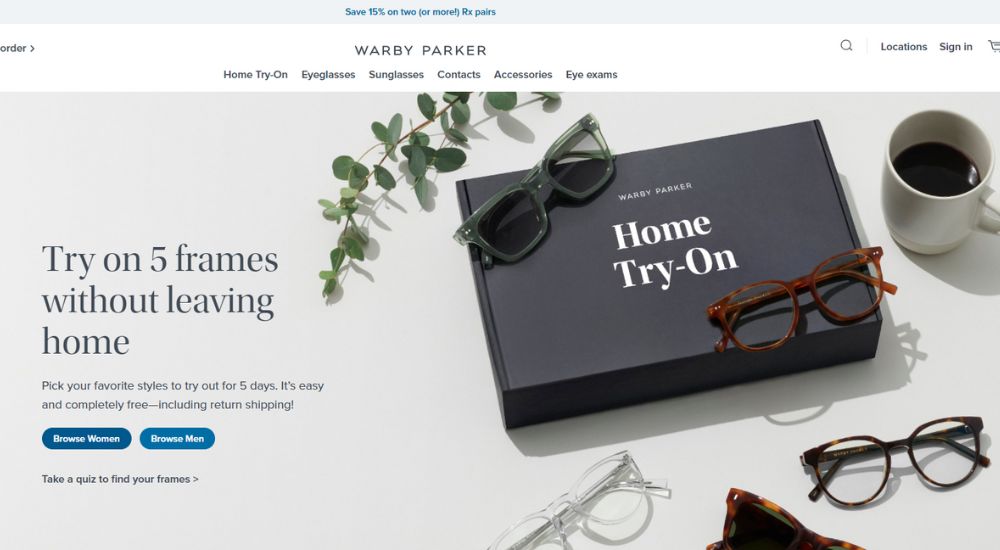
Warby Parker is an eyewear store that sells stylish and modern glasses. The Warby Parker website is designed very simply, with a minimalist design that makes it stand out. The approach is simple and straightforward, making it easy to find what you’re looking for. The look of the website is sleek and stylish, making you look as fashionable as the brand!
10. Esenzzia
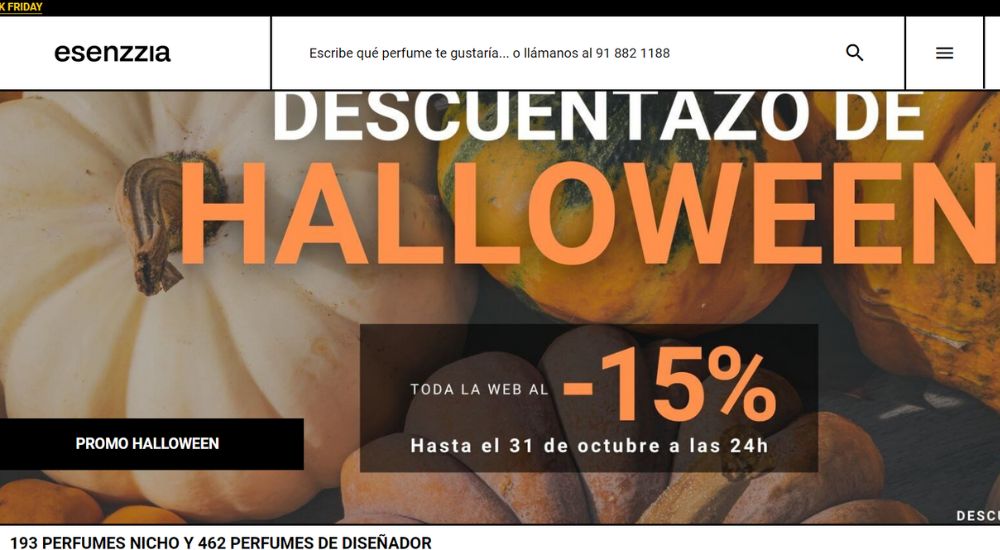
Esenzzia produces affordable colognes and is a high-quality perfume brand. Their website has a fresh and limitless potential that cannot be replicated. With plenty of white space to offer a clean and uncluttered browsing experience, the design is simple but elegant.
11. Larq
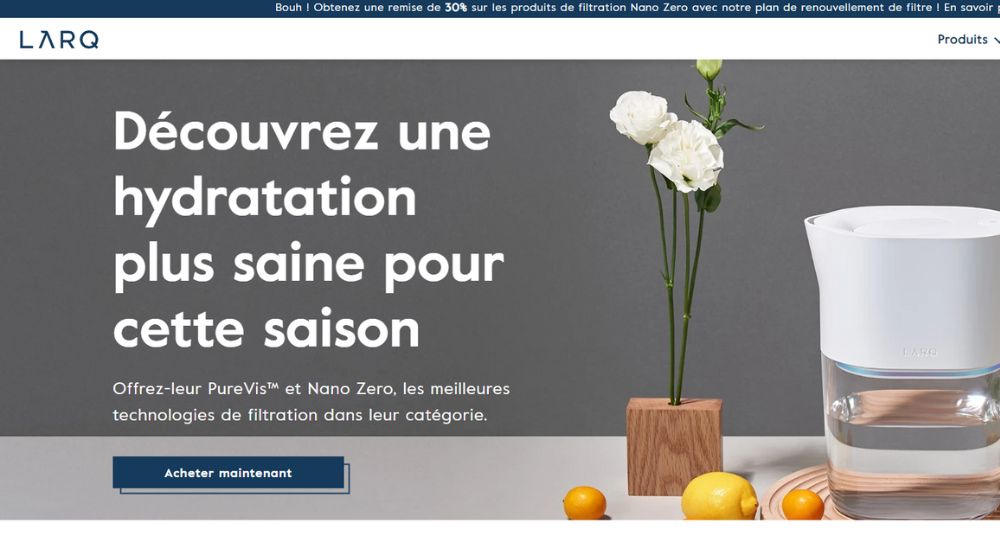
LARQ is a great reusable water bottle retailer that uses amazing copywriting, eye-catching product images and animations, and an interactive plastic waste calculator to attract customers. Their copy is on point and they really know how to capture people’s attention.
Everything about their website is stylish and modern, making it easy for people to navigate. They also have great color-block product features that really stand out.
12. Burrow
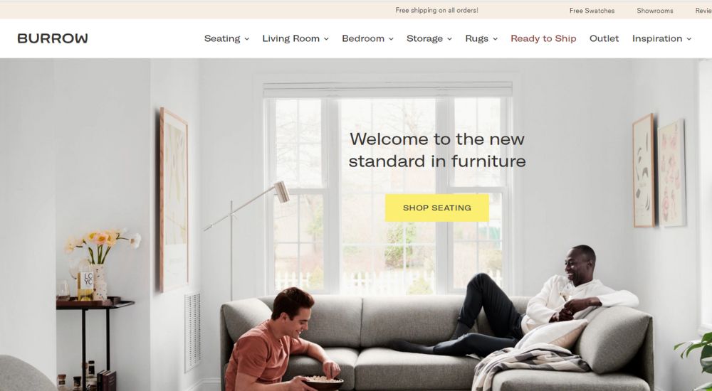
Burrow is a modular furniture retailer that specializes in designing and installing custom pieces of furniture in people’s homes. The brand believes that its modular design makes it easy for customers to customize their furniture to fit their own needs and that this provides them with a unique value proposition.
They have a home page video that demonstrates how easy it is to install custom pieces of furniture in your home. They also mix product pics with lifestyle pics on their homepage, showcasing the different ways their modular designs can be customized for the right fit. Finally, they provide a picture of one of their latest designs in your home, so you can get a sense of what they’re all about.
13. Skullcandy
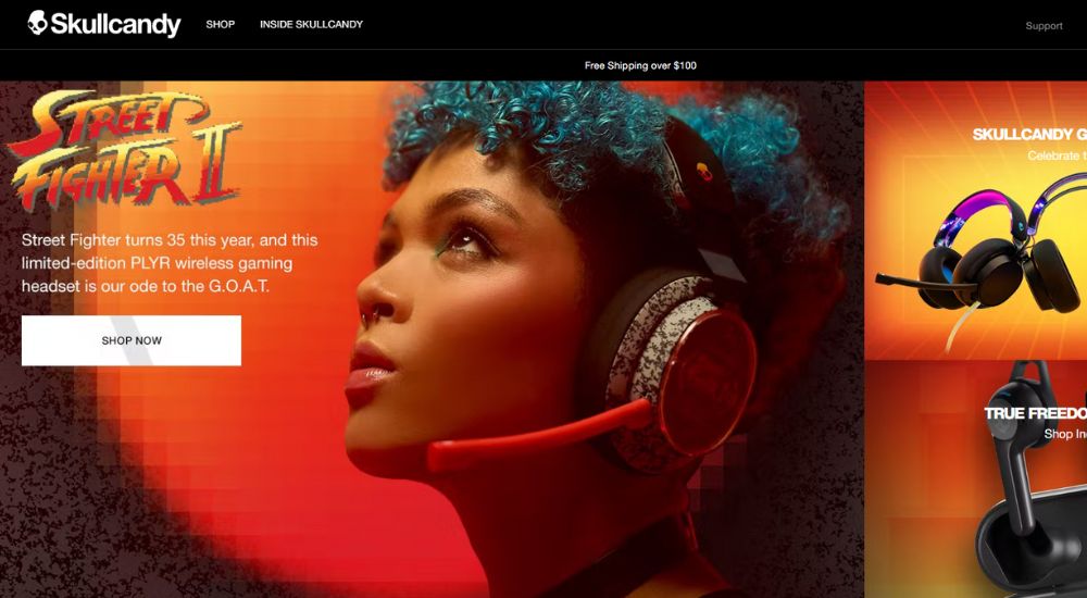
Skullcandy is a well-known audio brand that provides a variety of high-quality items. They made the decision to build their website in a sumptuous and bright color scheme in order to stand out from the crowd.
As a consequence, the site has a sleek, high-end feel to it, ideal for anyone who wants to believe they’re spending their hard-earned money on something special. The specs section provides all the information you need about each product, and the site is easy to discover and review in great detail.
14. Solo stove
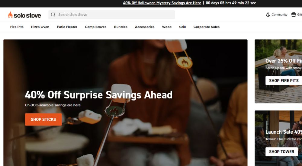
The use of iconography in eCommerce is exemplified by the Solo Stove. They not only have unique icons for each product class, but they also include How-to instructional videos, images, and FAQ sections that describe their key characteristics. Without having to go through a lengthy list of text, this makes it simple for consumers to comprehend the item and locate the data they want.
15. Bliss
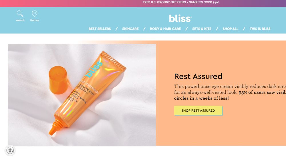
Millennial pink, baby blue, and Gen Z yellow are the three primary colors used by the Bliss website. The intention is to make you feel like you’re conversing about your skincare routine with your closest friend. They want you to be able to locate what you’re looking for quickly and easily on their website, without getting overwhelmed or confused.
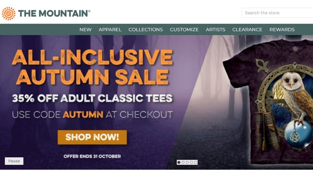
16. The Mountain
Bliss provides consumers with a simple way to browse through numerous product categories and get information on shipping and potential delays. Beauty, health, food, home, and lifestyle are the four primary product categories.
Bliss includes promotions and special offers every month that are sure to catch consumers’ attention. In addition, a service banner appears on the website that informs consumers about shipping conditions and possible delays. Bliss is a simple eCommerce website using a flat design that provides an abundance of helpful data to users.
17. Dark City Gallery
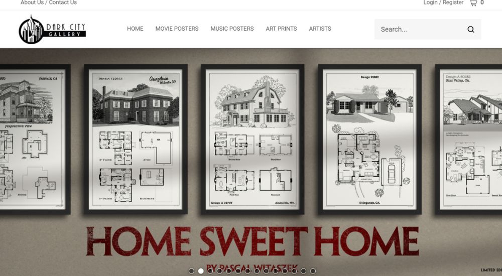
Dark City Gallery is a great place to sell prints and posters. Their eCommerce website uses a flat design, which makes them look attractive and easy to navigate. Plus, their prices are very competitive, so you’ll be able to make a lot of money off of your prints and posters.
18. Greats
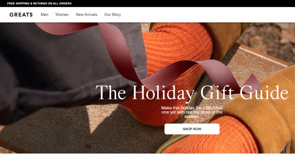
Greats specializes in high-end designer shoes, and their product photos are typically some of the biggest you’ll see, making them ideal for an eCommerce site with fewer products to sell.
19. Rough Trade
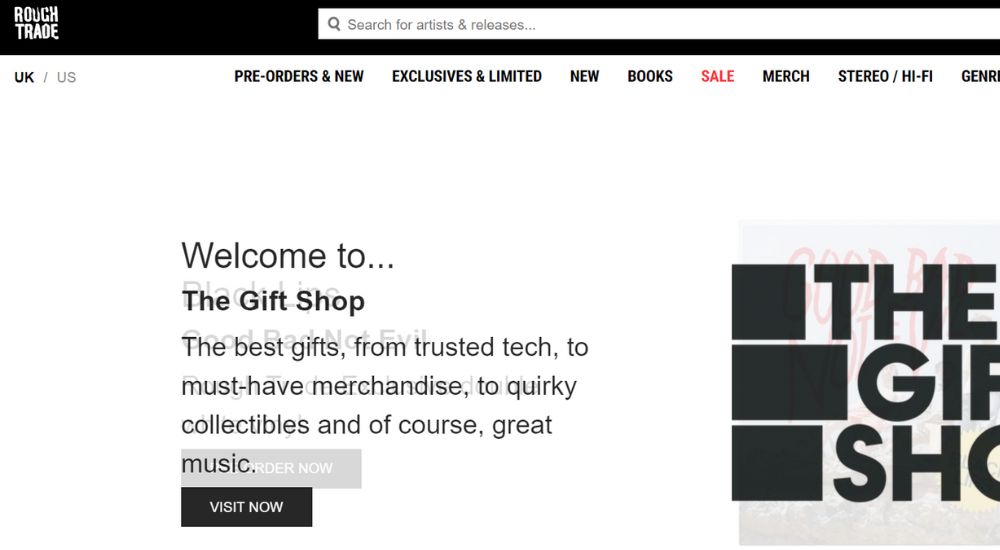
If you’re a music lover, then there’s no reason not to check out Rough Trade. This record store is filled with all types of vinyl records, CDs, and other music merch, and it has everything you could possibly want or need. Plus, Rough Trade is one of the most responsive design-conscious stores I’ve ever seen.
Not only does it have an incredible wish list tool that lets you browse through your desired items with ease, but the search function is also incredibly powerful. You can filter by genre or artist, and even find specific albums or tracks that you’re looking for.
20. Kipling
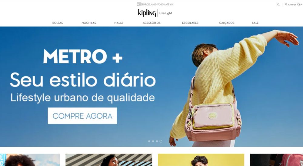
Kipling is a well-known and popular brand that specializes in carrying bags. It is known for its soothing colors, simple typography, bold images, and horizontal scrolling. All of these elements work together to create a perfect combination that appeals to a wide range of people. Its store is a prime example of flat design for an eCommerce website.
Wrap Up
Flat design showcases the power of simplicity in the digital space. These 20 examples prove that you don’t need clutter or complexity to create a standout website. Instead, with the right balance of colors, shapes, and design principles, minimalism can shine brightly.
Whether you’re a designer seeking inspiration or someone who appreciates clean aesthetics, we hope this list has offered a fresh perspective on what modern web design can achieve. Remember, sometimes less really is more!

