In the fast-paced world of e-commerce, where a single click can determine whether a sale is made or lost, the checkout page stands as the ultimate battleground. A well-designed checkout page holds the potential to significantly reduce cart abandonment rates, driving higher conversion rates and fostering customer loyalty.
If you’re a web owner or an e-commerce enthusiast seeking to optimize your checkout process, you’re in the right place. In this article, we will unveil a curated collection of 15 great examples of checkout pages that have been crafted to perfection. These real-world examples will not only inspire you but also provide valuable insights into the essential features and design elements necessary to create an outstanding checkout page for your online store.
How To Create A Checkout Page Effectively?
Creating an effective checkout page is crucial for converting potential customers into paying ones and ensuring a smooth and satisfactory shopping experience. Here are some key steps and tips to help you create a checkout page effectively:
1. Choose the right e-commerce platform
Choosing a good platform is the must-taken step to have an excellent checkout page. Each one already has a particular flow checkout.
Some platforms set one-page checkout as their default (like Magento), and if this is what you want, then you can make minor changes and use it right away.
2. Enable Guest Checkout
Offering a guest checkout option is essential for reducing friction in the buying process. Not all customers want to create an account before making a purchase. By enabling guest checkout, you allow customers to complete their transactions quickly without the hassle of signing up, increasing the likelihood of conversion.
3. Include Trust Signals
Prominently display security badges and seals to show customers that your e-commerce platform takes safety very seriously. These badges should be displayed during the checkout process to ensure security in the system.
4. Provide different payment options
Offer a variety of payment methods to cater to diverse customer preferences. The primary payment method should be highlighted, but include other popular options like credit/debit cards, digital wallets (e.g., PayPal, Apple Pay), and any local payment methods that are relevant to your target audience. The more payment choices customers have, the more likely they are to complete the purchase.
5. Prioritize mobile user experiences
With the increasing number of mobile shoppers, optimizing the checkout page for mobile devices is vital. Ensure that the checkout process is mobile-friendly, with easy-to-read fonts, large buttons, and a responsive design that adapts to various screen sizes. Mobile users should have a seamless and intuitive experience throughout the checkout process.
6. Minimize Distractions
Checkout should generally be clear and limited distractions. Eliminate any distractions to keep customers on the purchase and focused on tracking to the end of the conversion funnel.
7. Test, review, adapt, repeat
Regularly test and review your checkout process to identify areas for improvement. Analyze user behavior, conduct A/B testing, and gather feedback from customers to understand pain points and optimize the checkout flow. Continuously iterate and refine the checkout experience based on insights and best practices to ensure a smooth and frictionless process for your customers.
Best Examples Of Checkout Pages
1. Nike
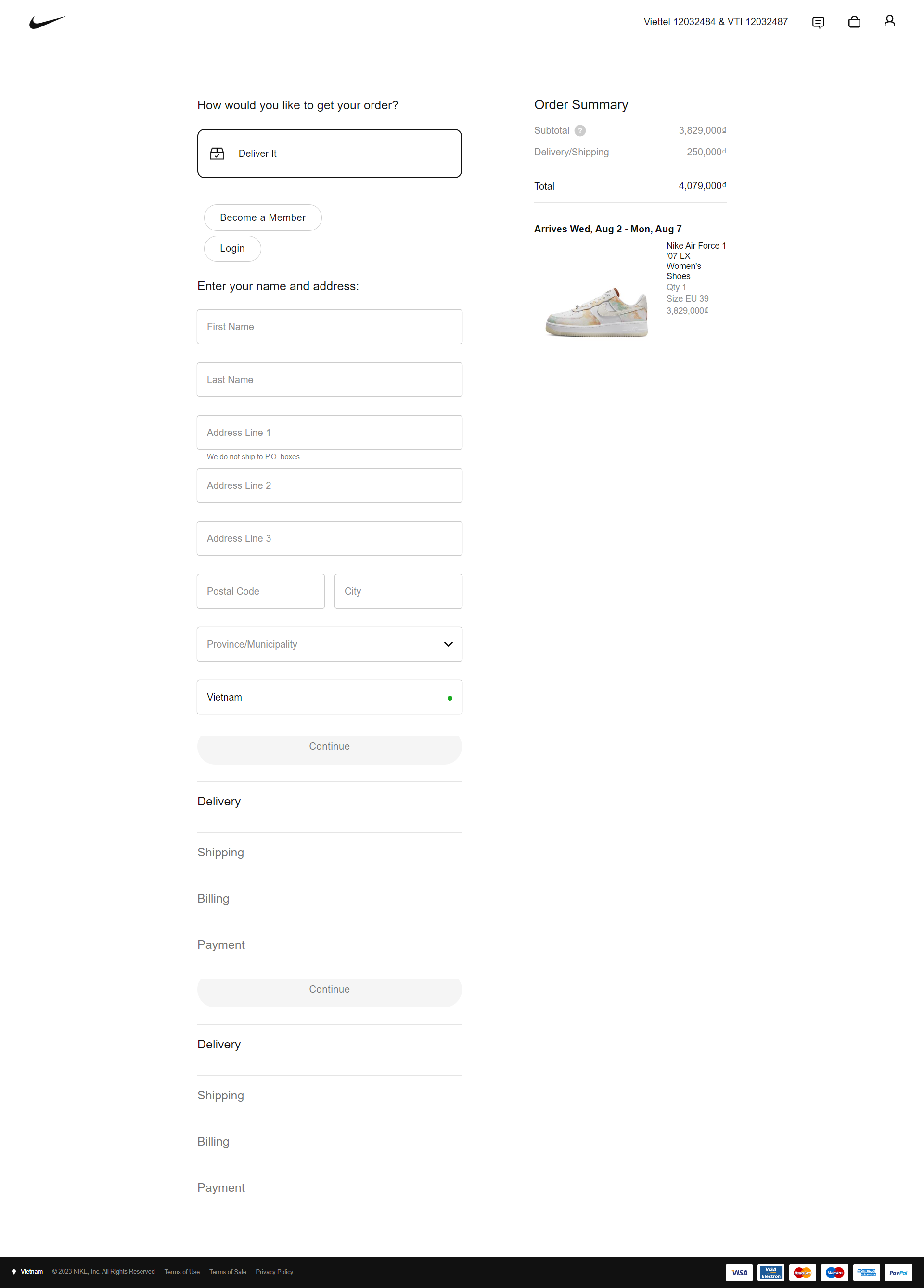
Nike’s a renowned global brand in the sports and athletic wear industry. Its checkout page combines a simple, sleek design with a clear and concise information presentation. As a leader in e-commerce, Nike understands the significance of providing customers with a smooth and hassle-free checkout process. Their dedication to delivering an exceptional user experience is evident in the carefully crafted checkout page that incorporates several best practices to ensure customer satisfaction.
Features
- Edit Cart Functionality: Nike allows customers to make last-minute adjustments to their orders, such as modifying quantities, adding or removing items, or applying promotional code
- Order Summary Display: The checkout page provides customers with a clear and concise overview of their selected items, their respective quantities, and individual prices, eliminates any potential confusion, and reinforces trust between the brand and its customers
- Inclusive of Additional Costs: . The brand ensures that all relevant expenses, such as taxes, shipping fees, and any other applicable charges, are clearly displayed and included in the order total.
- Self-Contained Checkout: Customers can easily navigate through the checkout steps without being redirected to multiple pages
2. Walmart
Walmart’s checkout page stands out for its user-friendly design, making the purchasing process quick and efficient. It offers various payment options, caters to both guest checkout and account creation, and ensures security for users’ information. The page is optimized for mobile devices and provides clear shipping choices. With a focus on transparency, Walmart allows customers to review their order details before completing the purchase.
Features
- Delivery and Store Pickup Options: Customers can select their preferred delivery method, including home delivery or the option to collect their purchases from a nearby Walmart store.
- Guest Checkout Enabled: Customers don’t need to log in to buy products with guest checkout which requires minimal information. On the other hand, customers who wish to create an account can do so conveniently, which allows for a more personalized shopping experience in the future.
- Clear Presentation of Additional Costs: Walmart provides a clear breakdown of additional costs, such as taxes, shipping fees, and any applicable discounts or promotions
- Prominent Order Summary: This summary displays all the items in the shopping cart, their individual prices, any applied discounts, and the final total cost, giving customers the opportunity to make any necessary adjustments before proceeding to the final payment.
3. Zara
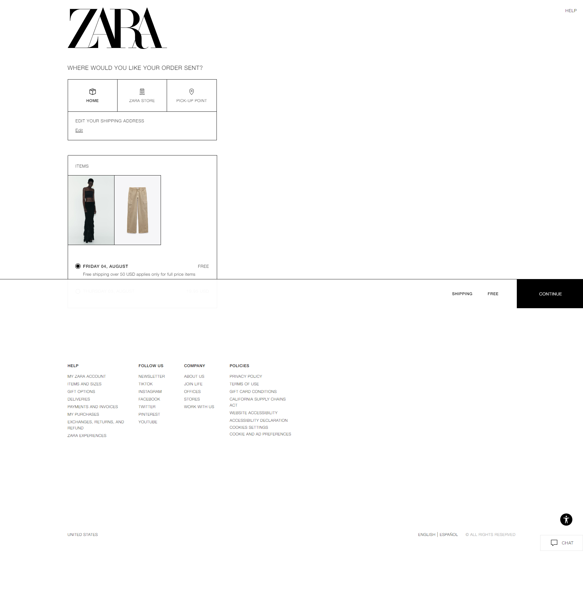
Zara’s checkout page is renowned for its user-friendly experience. With a clean and minimalist design, it offers guest checkout or easy account creation. The form fields are intuitive, and saved payment options streamline future purchases. Real-time shipping updates provide confidence, while transparent pricing and policies ensure trust. The one-page layout allows for quick review and editing of orders. The page is also mobile-responsive and prioritizes secure transactions to protect customer data.
Features
- Saved Payment Options: Customers have the option to either proceed with a guest checkout, allowing them to make purchases without creating an account, or easily create an account for quicker future purchases.
- Real-Time Shipping Updates: This feature allows shoppers to track their orders in real time, ensuring they stay informed about the status and estimated delivery time of their purchases.
- One-Page Checkout: This feature allows customers to securely store their preferred payment methods, making subsequent purchases faster and more convenient. By streamlining the payment process, Zara reduces cart abandonment rates and encourages repeat business.
- Quick and Intuitive Form Fields: The form fields are well-organized and labeled clearly, guiding customers through each step of the process with ease.
4. Samsung
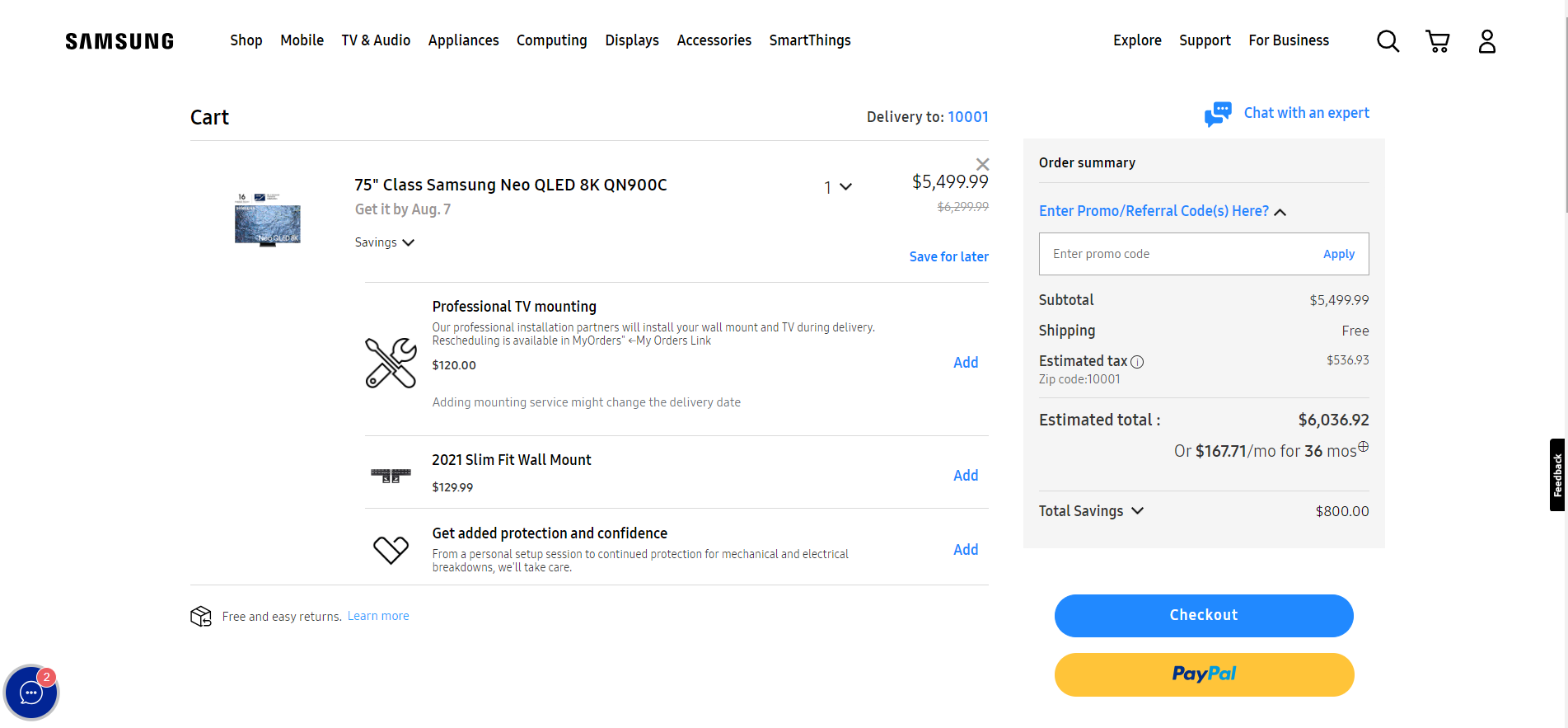
Samsung’s checkout page sets a high standard for an efficient and user-friendly e-commerce experience. It emphasizes simplicity, multiple payment options, and transparent information. The page is optimized for mobile devices and offers reliable order tracking. Samsung’s approach showcases how businesses can create a seamless checkout process for customers.
Features
- Flexible Payment Options: Samsung’s checkout page follows the principle of simplicity, streamlining the entire process and removing any unnecessary steps. Each element on the page is strategically placed, and the overall design is clean and clutter-free.
- Mobile Responsiveness: The layout adjusts to different screen sizes, making it easy for customers to navigate and complete their purchases on smartphones or tablets.
- Upselling and Cross-selling: By recommending relevant and complementary products at the right moment, Samsung maximizes the chances of customers adding more items to their carts before finalizing their purchases.
- One-click Purchases (for logged-in users): Once logged in, users can make purchases with just a single click, bypassing the need to re-enter payment and shipping information.
5. Chubbies Shorts
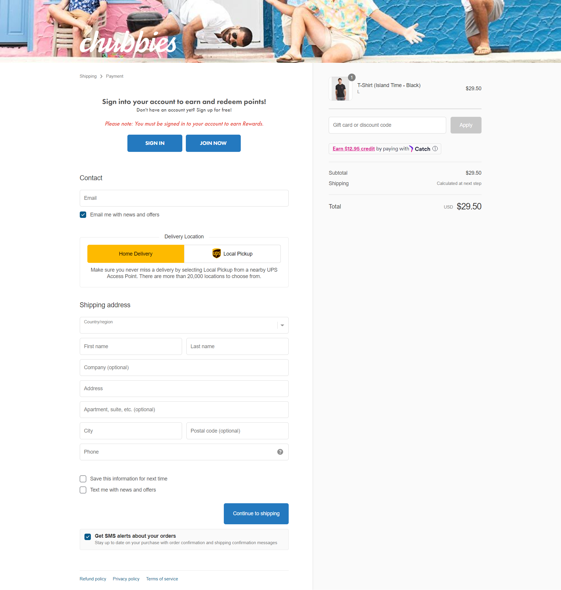
Chubbies Shorts excels in the fashion industry with its outstanding checkout page. Seamlessly designed for a smooth shopping experience, it impresses customers by considering their unique needs. The page reflects its commitment to providing a user-friendly platform where customers can easily navigate through the checkout process. With a clear and concise layout, it ensures transparency and clarity regarding the order. Chubbies Shorts goes above and beyond by offering additional features to keep customers informed and engaged, contributing to an exceptional overall shopping journey.
Features
- Clear order summary: As customers progress through the checkout process, they are presented with a detailed breakdown of their order, including the selected items, quantities, prices, and any applicable discounts or promotions.
- Shipping options: Customers can select the shipping method that best suits their needs, whether it’s expedited delivery for those who can’t wait to get their hands on their favorite shorts or standard shipping for those who prefer a more economical choice.
- Text alerts: By enabling this feature, shoppers can stay up-to-date on their order’s status, from confirmation to shipping updates and delivery notifications.
- Editable cart: If shoppers realize they need to make adjustments to their order, such as changing quantities, removing items, or adding new ones, they can do so effortlessly within the checkout page.
6. Amazon
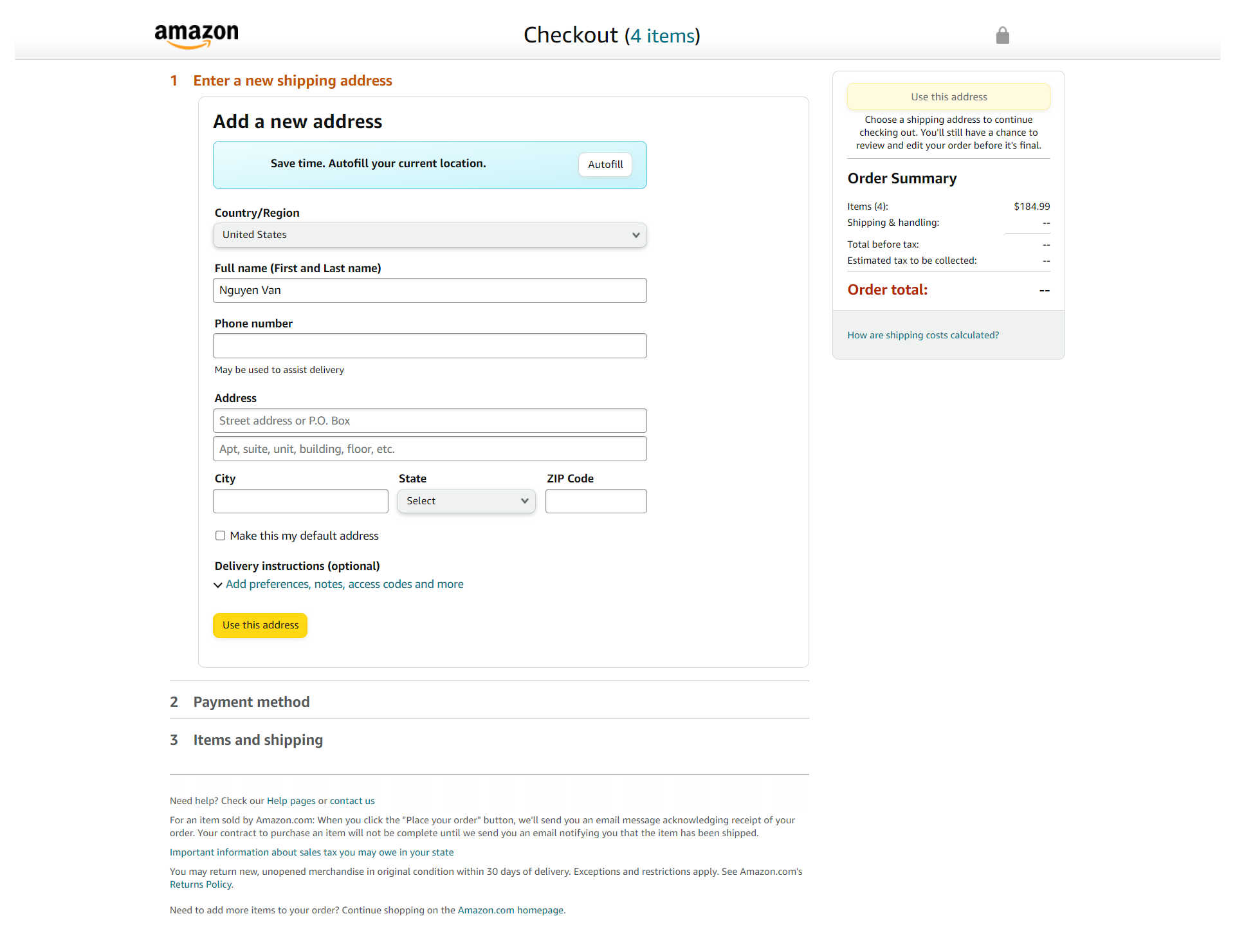
Amazon, the world’s leading online retailer, exemplifies an exceptional checkout page. With a focus on user-friendliness, security, and convenience, Amazon streamlines the buying process, leaving a lasting impression on customers. Features like guest checkout, one-click purchase, and transparent order summaries enhance the shopping experience. By setting new industry standards, Amazon’s outstanding checkout page fosters customer loyalty and maximizes conversion rates. Whether you’re an e-commerce professional or a business owner, studying Amazon’s approach provides valuable insights into creating an optimized and successful checkout journey.
Features
- User-Friendly Design: Amazon’s checkout page boasts an intuitively designed interface, ensuring a frictionless and easy-to-navigate experience for customers. The layout is clean and uncluttered, with a clear focus on guiding users through the final steps of their purchase effortlessly.
- Guest Checkout & AmazonPay Option: Amazon allow users to complete their purchase quickly without the need to register or log in, reducing potential barriers and encouraging more spontaneous transactions.
- Order Summary & Shipping Details: Taxes, discounts, and shipping costs are also clearly itemized. Amazon offers various shipping options, displaying estimated delivery times and costs upfront.
- Secure & Trustworthy: Amazon prioritizes security throughout the checkout process. Customers can be confident that their personal and payment information is safeguarded with state-of-the-art encryption and security measures.
7. Crate and Barrel
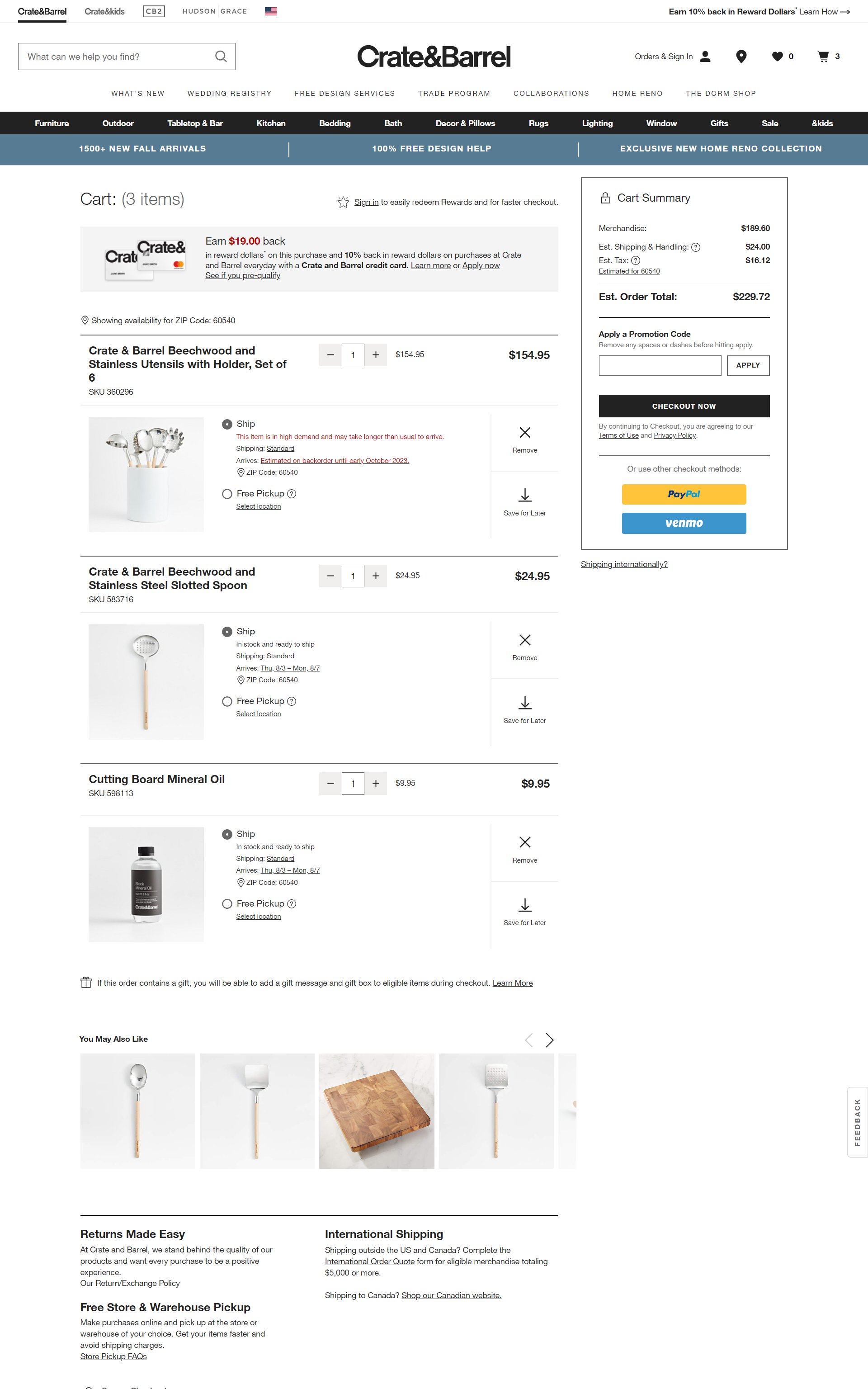
Crate & Barrel, a prominent modern furniture brand, stands out with its exemplary checkout page that showcases a design aesthetic focused on security, transparent pricing, and user-friendly features. Whether customers are purchasing kitchen appliances, home decor items, or dinnerware, the Crate & Barrel checkout page ensures a seamless and reassuring experience.
Features
- Minimal Form Fields: Crate & Barrel checkout page is its emphasis on minimalism. By eliminating unnecessary distractions, the brand ensures that customers can focus solely on completing their purchases, resulting in a higher conversion rate and overall satisfaction.
- Progress Bar: This progress bar is strategically placed to keep customers informed about their current stage in the checkout process by displaying clear and concise steps, such as “Shipping Information,” “Payment Details,” and “Order Review” ….
- Transparent Pricing: Throughout the entire checkout process, customers are presented with a detailed breakdown of the costs involved. This includes product prices, shipping fees, taxes, and any additional charges, ensuring there are no surprises when it comes to the final payment.
8. Threadless
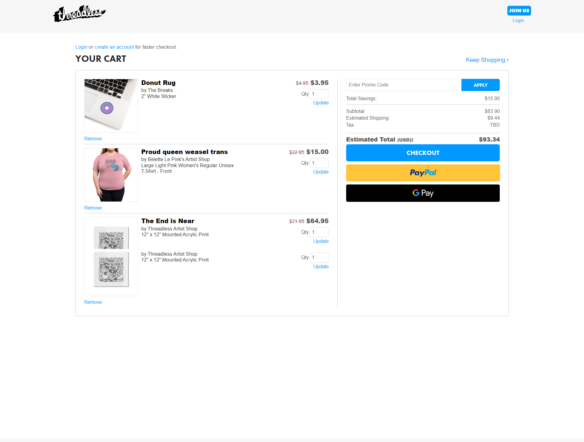
Threadless, a renowned design-led enterprise with a vibrant artist community, sets an outstanding example of a checkout page that seamlessly blends creativity with functionality. Their checkout process not only complements their brand image but also prioritizes user experience, making it an exceptional model for other e-commerce platforms to follow.
Features
- Guest-Friendly Options: Threadless understands that not every user wants to create an account to make a purchase. To cater to a wider audience and reduce barriers to checkout, they offer a guest checkout option.
- Real-Time Cart Editing: Threadless implements real-time cart editing directly on the checkout page, customers no more need to navigate back and forth between the cart and product pages to modify the order.
- Secure Payment Options: Ensuring the safety of users’ financial information is crucial in gaining their trust during the checkout process.
- Streamlined Accordion-Style Checkout: Threadless’ checkout page is sleek and intuitive. They utilize an accordion-style layout, where each step of the checkout process is displayed in a collapsible section.
9. Byredo

Byredo creates a checkout page that surely leaves an impression. They use best practices, creating a simple, sleek design to provide concise and easy-to-understand information. They also have form validation and error messages to ensure customers enter their data correctly.
Features
- Accordion-style checkout: Different sections of the checkout process, such as shipping information, payment details, and order summary, are neatly organized into expandable sections.
- Order summary prominently displayed: Gives the customers a clear overview of their selected items, their quantities, and the corresponding prices.
- Additional costs (shipping/taxes/etc.) displayed: Prevents any unpleasant surprises for customers during the final stages of checkout, allowing them to make informed decisions before proceeding with their purchase.
- Multi-choice payment options: Offers various payment methods such as credit cards, PayPal, Apple Pay, and other popular payment gateways.
10. Helly Hansen

Helly Hansen’s checkout page design is simple and elegant. Users can choose their language, which is convenient for international customers. Information is displayed upfront, so there are no surprises at the end.
Features
- Order summary: Provide a concise overview of the items in the cart, their individual costs, and the total amount payable.
- Isolated checkout with limited distractions: By eliminating unnecessary elements, such as navigation bars and advertisements, the brand encourages users to concentrate solely on finalizing their orders.
- Form validation and error notification: As users enter their information, the form immediately provides feedback on any errors or omissions, guiding them to rectify the mistakes promptly
- Different payment choices
11. Tommy Hilfiger

Tommy Hilfiger’s checkout page design is highly stylish while ensuring legibility. The order summary section shows clear information for users to easily understand, including tax and shipping fees.
The two highlights of this page checkout are that it has a back-to-top button for easier navigation. Moreover, a donation section encourages users to contribute to the community.
Features
- Order summary: Provides users with a comprehensive breakdown of their purchase, leaving no room for confusion.
- Total cost components displayed: Breakdown includes a detailed account of the items in the cart, their individual prices, any applied discounts, taxes, and shipping fees.
- Guest checkout: Allows users who do not wish to create an account to proceed with their purchase quickly.
12. Sigma Beauty

Sigma gives users a checkout page with a simple design, easy to use. The beauty retailer clearly demonstrates two steps in their checkout process: delivery and payment. Sigma provides users with shipping packages at different prices, which offers customers more options for delivery.
Features
- Checkout contents saved for later use: Prove immensely beneficial for customers who might want to revisit their cart at a later time to complete the purchase.
- Discounts available to all customers: Sigma ensures that discounts are readily available to all customers during the checkout process, entices new buyers and rewards loyal customers, fostering a sense of appreciation and loyalty towards the brand.
- Variety of delivery and payment options: Customers can choose from a variety of delivery speeds and costs, granting them the flexibility to receive their orders according to their specific needs.
13. Omega

Omega checkout page impresses with its elegant and luxurious design. The checkout steps are easy to follow. Customers have all the information on one page, thus it’s more convenient if they need to recheck any field.
Features
- Access login and sign-up options easily: Customers are greeted with easily accessible login and sign-up options. This is an Omega’s effort to personalizing the experience and cater to both new and loyal customers alike.
- Accordion-style checkout guides the process: Ensures that customers are not overwhelmed by a long, intimidating list of steps but instead encounter a series of collapsible sections that unveil the necessary information in a step-by-step manner.
- No distractions: By keeping the page clean and clutter-free, customers are less likely to be sidetracked by unnecessary information or promotions, enhancing their overall shopping experience.
14. Paul Smith

Paul Smith’s checkout page design lies in the user support features. If you want to edit your cart, such as adding or subtracting quantity, simply edit the order at this step. You can rest assured that the information you fill in the fields is saved, and you do not lose time filling it again.
Features
- Variety of delivery and payment options: Giving users the freedom to choose their preferred method for receiving their purchases and completing the transaction
- Live chat support: Ensures that shoppers can get immediate assistance and answers to any questions or concerns they may have during the checkout process.
- Solated checkout with distractions removed: Distractions are minimized to create a clean and focused checkout environment, preventing any unnecessary interruptions that could potentially lead to cart abandonment.
15. Harvey Nichols

Harvey Nichols impresses customers with instant checkout. Once you add an item to your shopping cart, the web will ask if you want to pay now or continue shopping. They also add a review step so customers can recheck everything once again.
Features
- Available guest checkout: Understanding that not all customers might want to create an account during the checkout process, Harvey Nichols provides an option for guest checkout.
- Variety language options: Customers can easily select their preferred language, making the entire shopping experience more user-friendly and accessible.
- Live massage contact: Customers who might encounter any issues or have questions during the checkout process can directly communicate with a customer support representative in real-time.
Wrap Up
There are more excellent examples of checkout pages out there, but the 7 mentioned are among the most impactful ones. To develop an excellent checkout page, you need to understand your customers’ expectations and experiment with different styles.
If you want to build a professional checkout page but don’t have much experience in web development, then it’s best to let a web development provider like Tigren handle the task.
With more than ten years of experience in e-commerce web development, we ensure that each page of your website will be built carefully and optimized with essential elements and functions. The final goal is to improve the customer experience, help you to sell more, and grow your business.

Read More:

